Move Cost Calculator
Self-Service Pricing & Quoting Platform
+24% completion · +18% conversion · 45% fewer correction loops
Overview
The Move Cost Calculator is a mobile-first self-service quoting tool that guides customers from inventory input to instant pricing, eliminating the friction that was pushing users to abandon and call.
The Calculator was Ship Smart's highest-traffic revenue entry point and its highest-exit one. The experience did not align with how digital-first users search, estimate, and build confidence. Many abandoned the flow and called for help, slowing sales and increasing the workload.
I redesigned it into a guided quoting experience that answers top questions in-flow, standardized the pricing data model to create a single source of truth across Sales and customer-facing tools. I rebuilt the inventory search backend from the ground up.
The root issue wasn't the form. It was a broken pricing data model with no standardized item names, no shared terminology, and no reliable output. Every quote produced downstream correction work.
"The calculator was meant to help customers, but instead it pushed them to leave, many never reaching sales."
— General Manager, Ship Smart
The redesign transformed the Calculator from a conversion bottleneck into a measurable lever for revenue and operational performance, with stronger funnel integrity and tighter integration with Ship Smart's tracking system.
Business Impact
Measured post-launch across completion, conversion, and operational workflows
CONVERSION
+24%
quote completion rate
+18%
conversion to booked shipments
-25%
average time on form
SUPPORT REDUCTION
-22%
quote-related support tickets
-40%
pricing-related complaints
| Reduced reactive calls and follow-ups
OPERATIONAL
-45%
manual pricing correction loops
| Unified pricing data model across Sales and customer tools
| Single source of truth for all quote outputs
Role: Lead Product Designer
Responsibilities: Research · Workflow and System Modeling · Interaction and Visual Design · UX Writing · Prototyping and Testing · Mobile-First Execution · Cross-Functional Delivery (Dev, Sales)
Tools: Figma · Google Analytics · Screen Recordings · Chat Transcript Analysis · User Interviews
Timeline: 12 Months
What I Owned
| Diagnosed the root problem as a pricing data architecture failure, not a UX problem, and rebuilt the backend inventory model before redesigning the interface
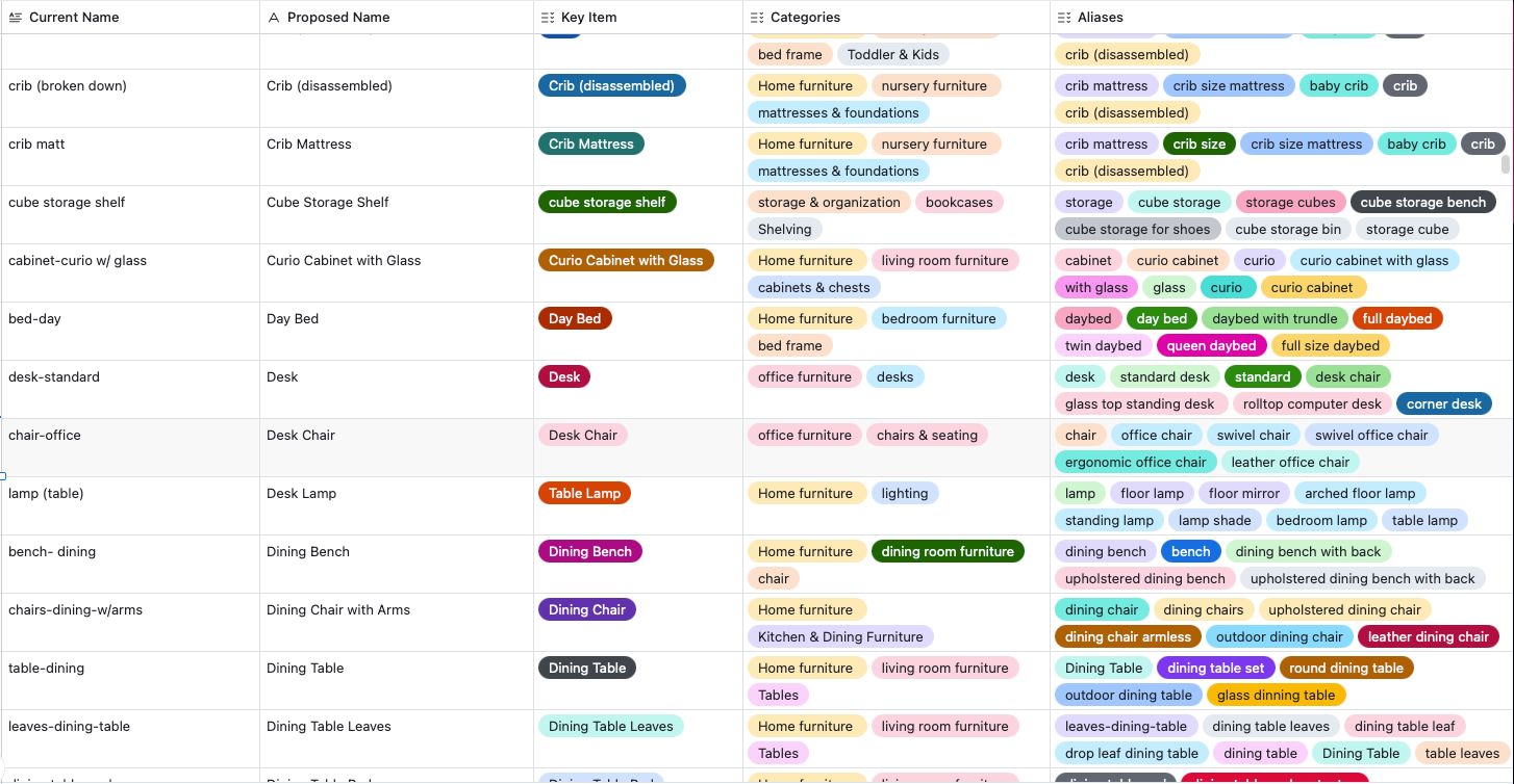
| Rebuilt the search backend by organizing item names, adding aliases, and creating searchable categories derived from 2,783 chat transcripts
| Standardized the pricing data model across Sales and customer-facing tools, creating a single source of truth for the first time
| Designed and tested two competing inventory input models (free-text search vs. category browse) to determine which reduced abandonment more effectively
| Connected the redesign to the broader Product Operating System research, using help center negative rating patterns to identify the shared pricing confusion across touchpoints
My Process
Design Question
How might we transform Ship Smart's highest-drop-off-revenue workflow into a guided self-service quoting experience that builds confidence, reduces friction, and increases conversion rates?
Research & Discovery
This project drew on the same platform-wide research initiative as the Product Operating System, combining analytics, screen recordings, and 2,783 chat transcripts to identify exactly where and why users were abandoning the flow.
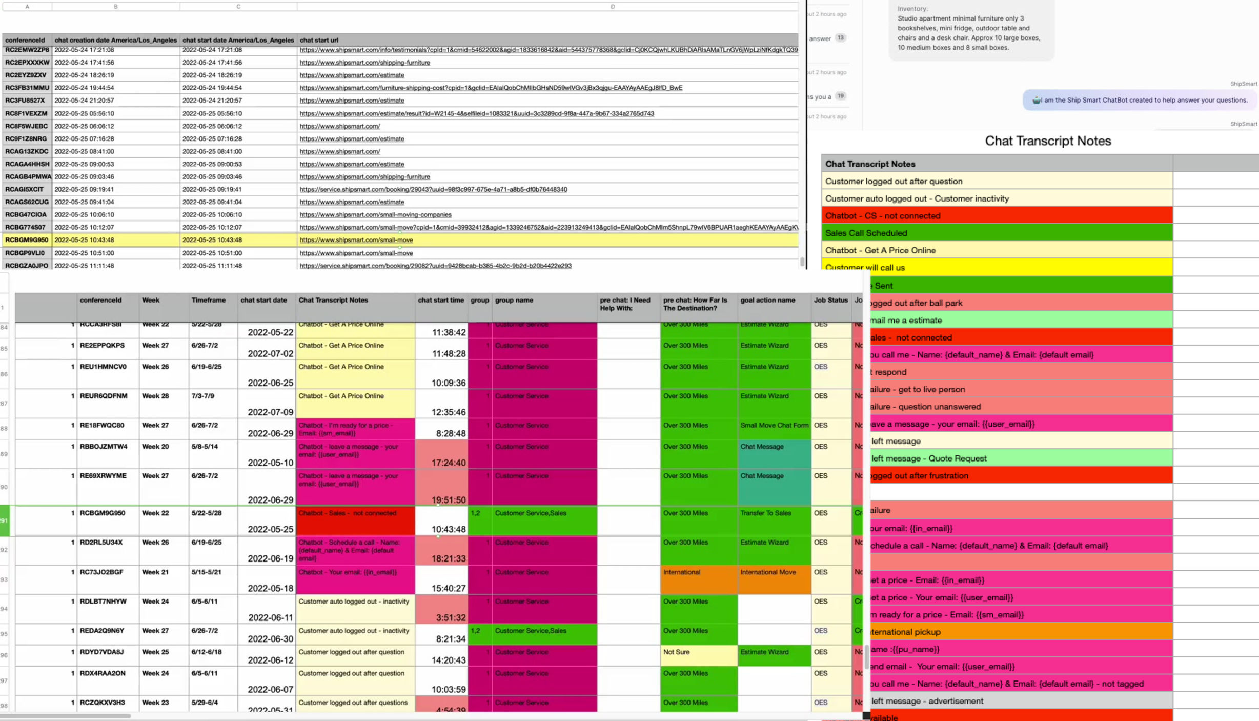
2,783 live chat transcripts at 95% confidence, surfacing the exact language customers used to describe their belongings and where the search failed them.
Method
Reviewed Google Analytics to identify bounce rates and drop-off points
Analyzed screen recordings to observe real customer friction
Conducted stakeholder interviews
Analyzed 2,783 live chats (95% confidence sample)
Comparative research across industries
Voice of Customer

Understanding The Problem
Key Insights
Six major flaws contributing to system failure, including a chat bug that caused 10% lead loss.
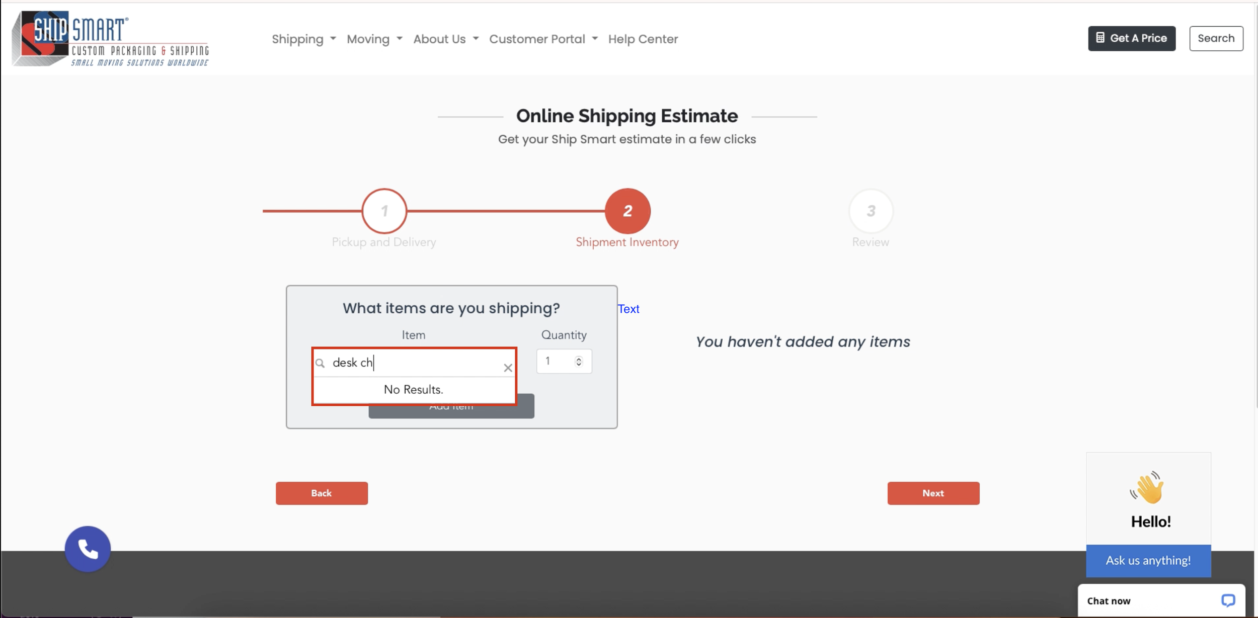
Search friction and poor item findability. Customers described items in plain language the search didn't recognize, causing abandonment before a quote could begin.
Dead-end workflow that pushed users to call. No fallback path, no in-context help. Customers who hit a wall called support — the outcome the tool was designed to prevent.
Missing details created unreliable quotes. Completed quotes were inaccurate enough to require follow-up calls, undermining the self-service value entirely.
No safe way to customize without breaking the quote. Users who tried to edit a single item had to delete and restart the entire quote.
High drop-off at the inventory and pricing steps. Analytics showed the steepest abandonment at the two steps requiring the most user input.
Language mismatch with user mental models. Internal logistics terminology didn't match how customers thought about their belongings, creating confusion at every input step.
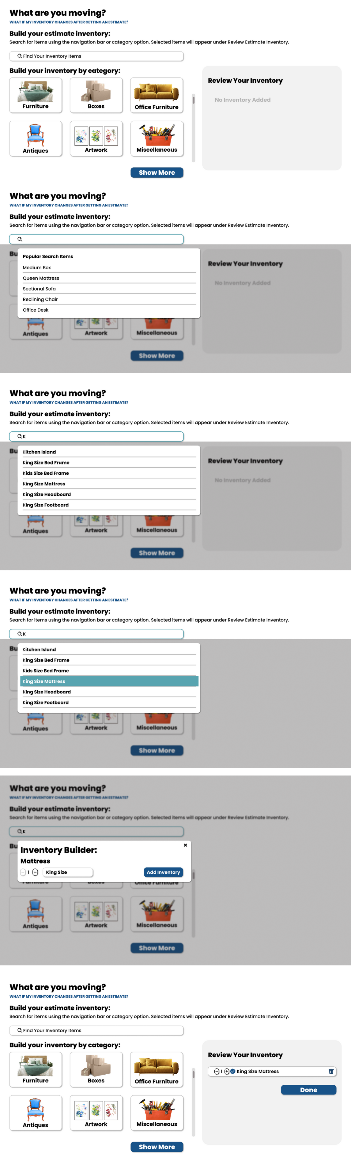
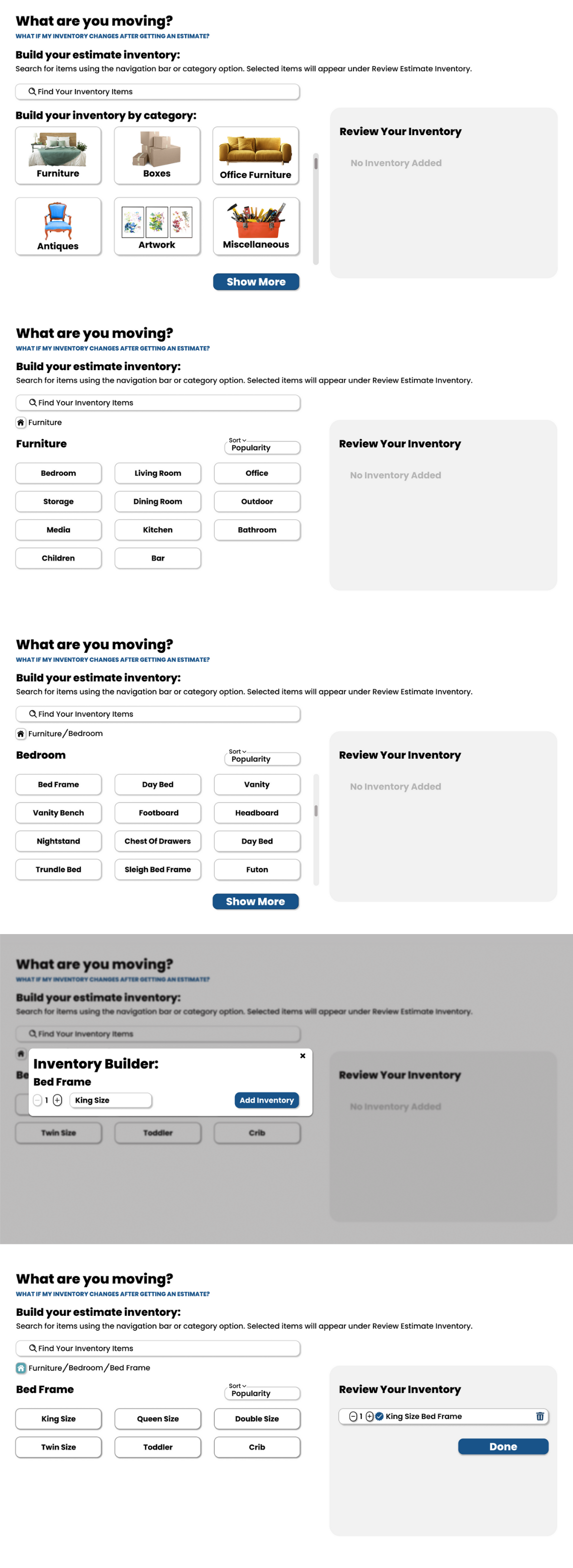
Searchability
I rebuilt the backend system by organizing item names, adding common aliases, and creating searchable categories based on how customers actually described their belongings in chat transcripts.
Personas
Nine personas capturing the full range of customer behaviors, with specific focus on Millennial and Gen Z digital-first segments previously underrepresented in conversion data.

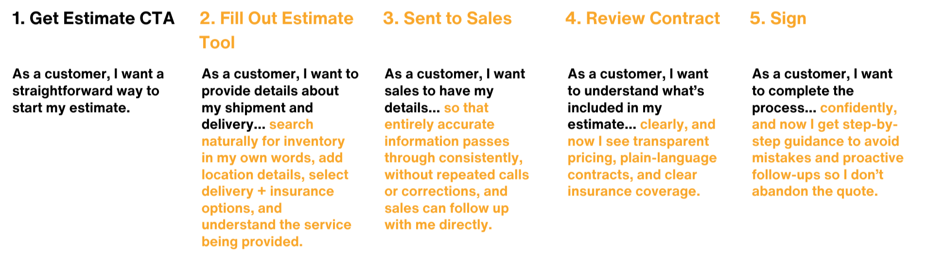
Revised User Journey
Mapped every decision point from inventory input to pricing confirmation, exposing three critical drop-off moments where users lacked confidence to continue. These became the primary design targets.
Wireframe
Started with full quoting flow wireframes to pinpoint where users hit issues on mobile, with emphasis on information hierarchy, sequencing, and decision points.
Low-fidelity Prototyping
Tested a new inventory model letting users quickly select predefined item groups by space type. Contextual questions under section headers answered common queries from sales calls, reducing uncertainty and keeping users in the flow.
MidFi Prototyping — Free-Text Search
A search-first inventory experience with real-time suggestions preloaded from historical data. As users typed, the system corrected spelling and narrowed results, reducing guesswork and preventing errors that caused hesitation.
MidFi Prototyping — Category Search
A guided browse-driven alternative for users who don't want to start with search. Items categorized by room reduced decision fatigue and built early momentum, testing whether structured discovery could decrease abandonment for users who needed reassurance.
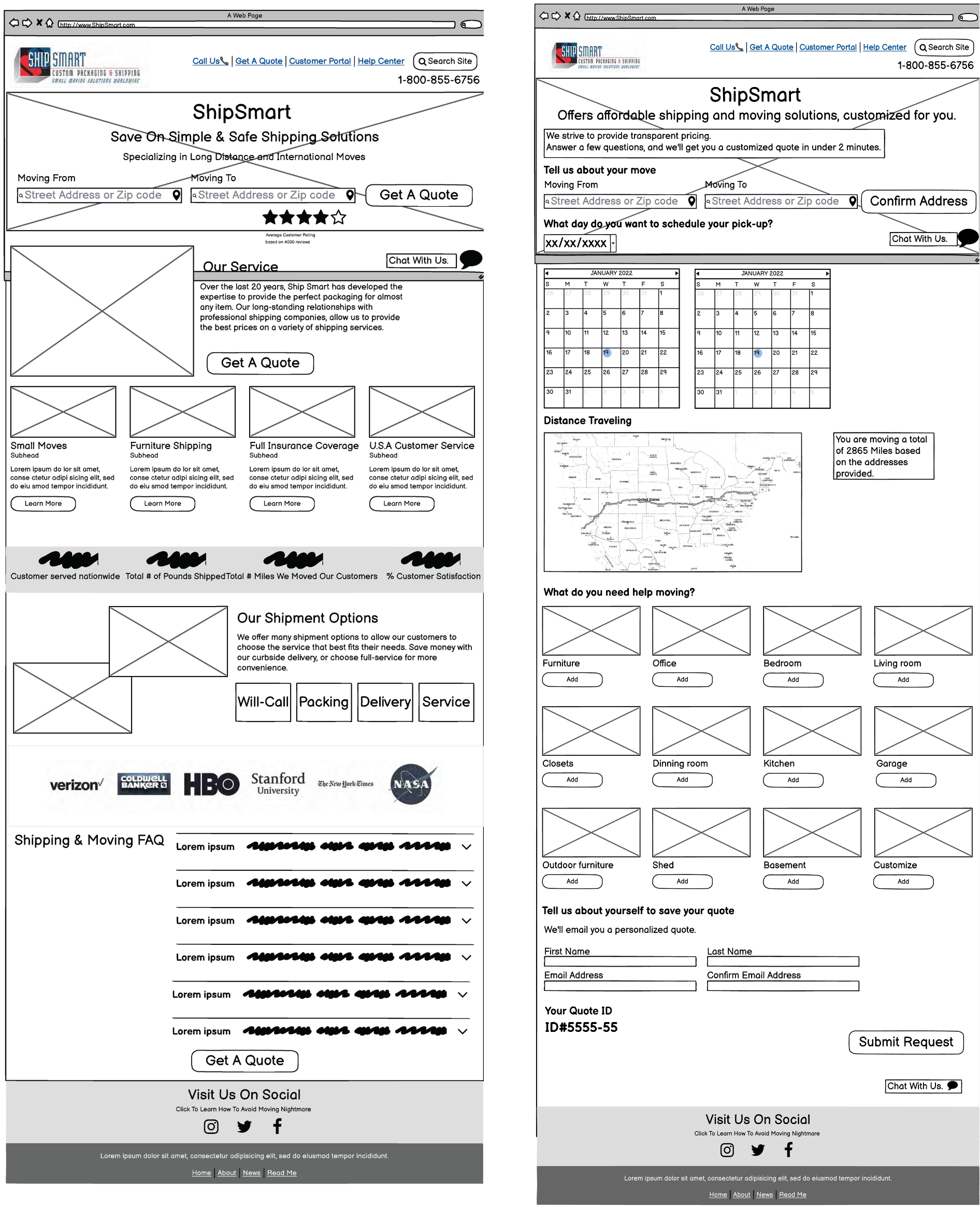
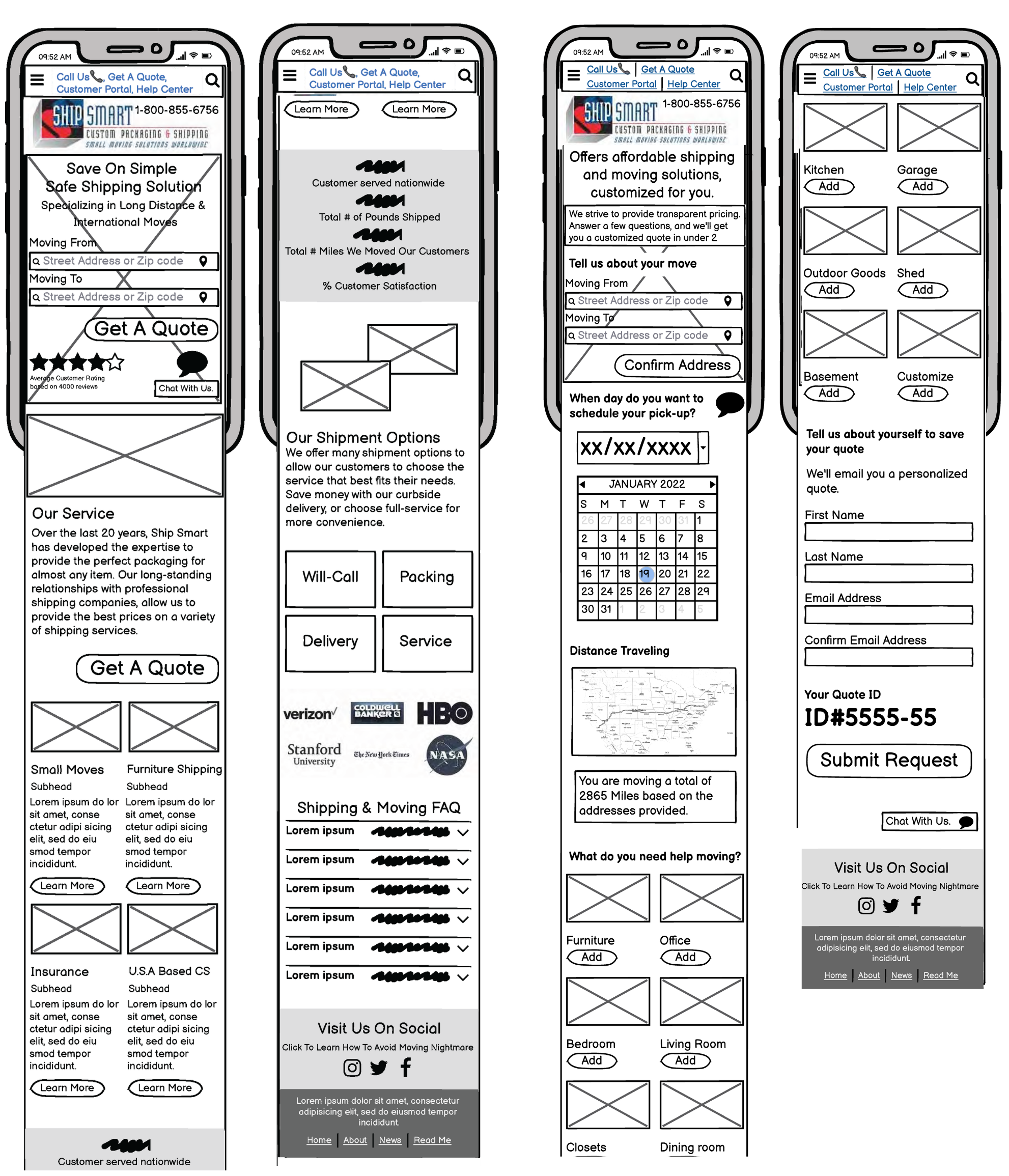
Final Design
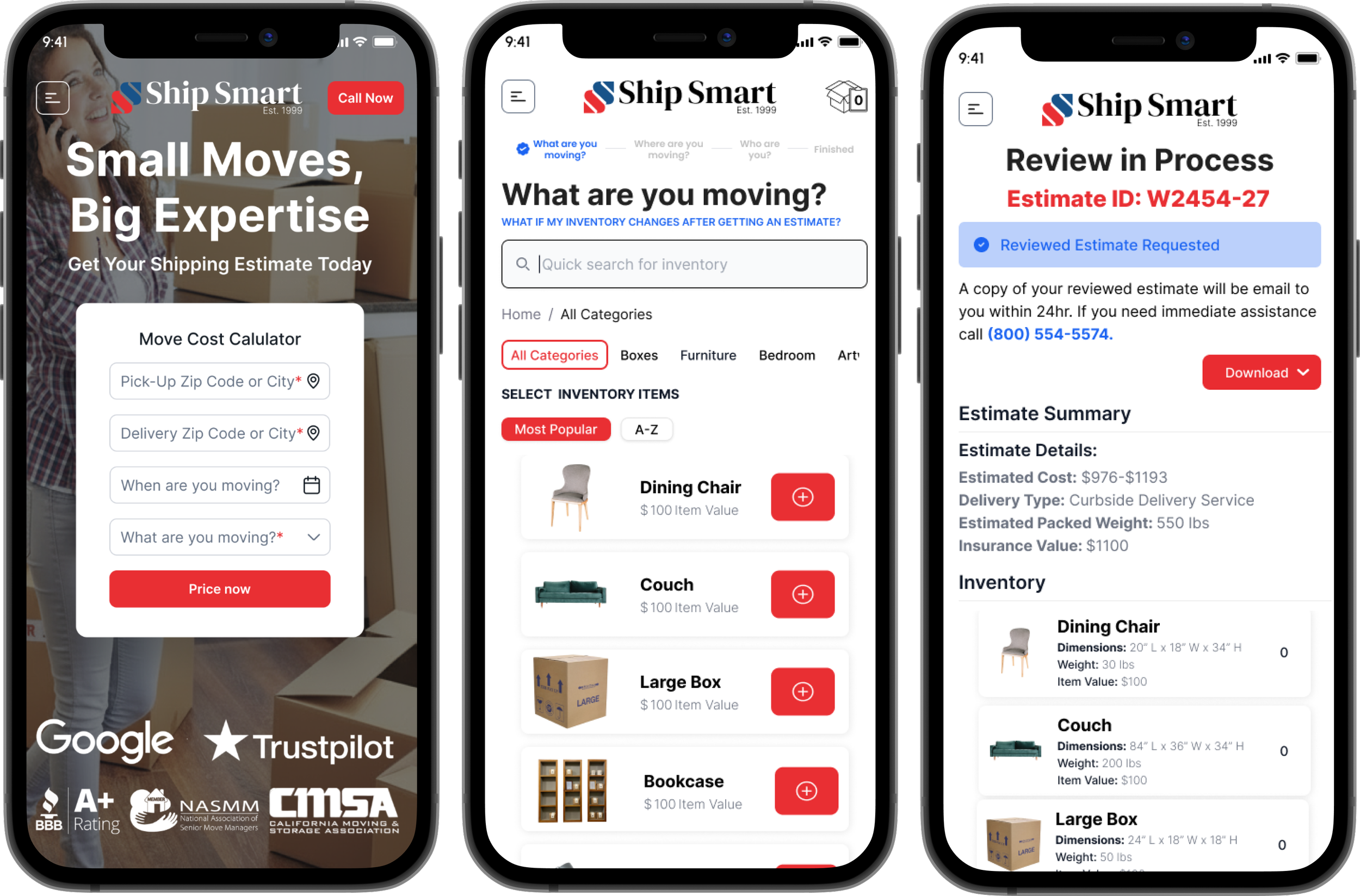
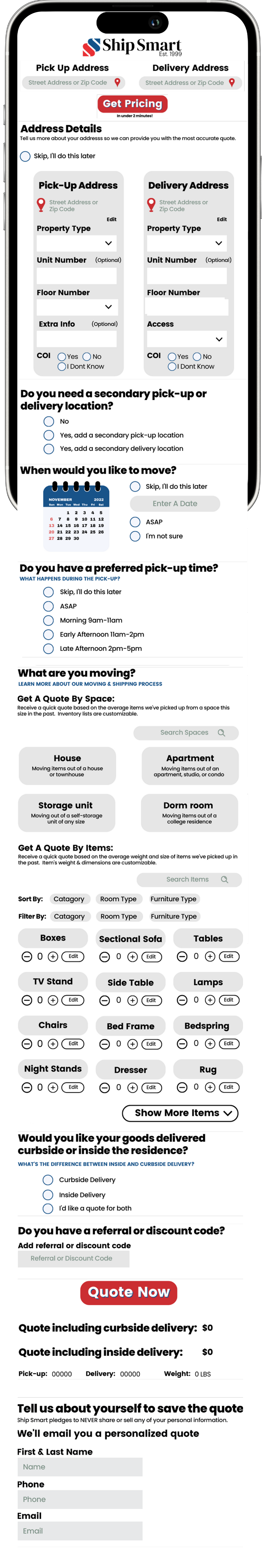
The final design delivers a guided, mobile-first quoting experience across three surfaces: the public-facing calculator, the inventory selection flow, and the pricing confirmation screen. Each step is designed to keep users moving forward rather than calling for help.
Move Cost Calculator Demo
Move Cost Calculator Mobile View

Entry Point
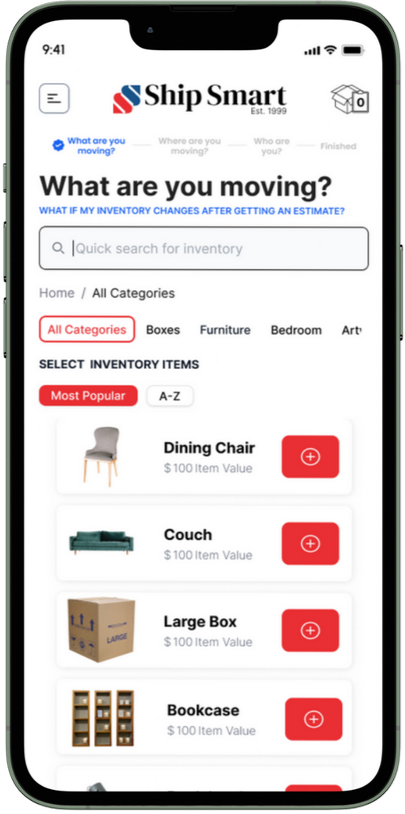
Inventory Input, and Search Interaction
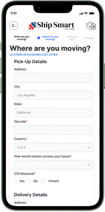
Address Input
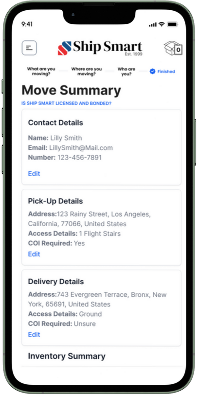
Move Summary

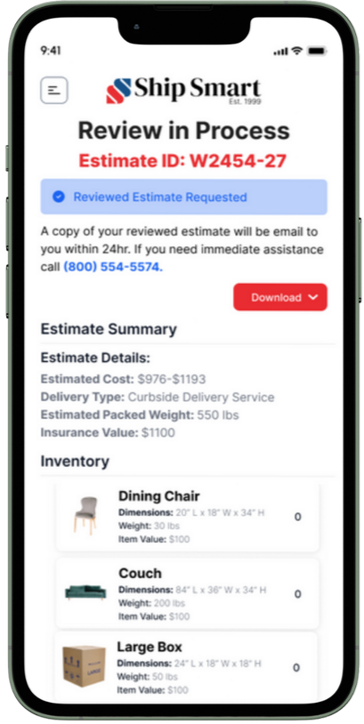
Pricing Confirmation
Review and Submit
Move Cost Calculator Desktop View

Homepage: The calculator entry point on the redesigned Ship Smart homepage.
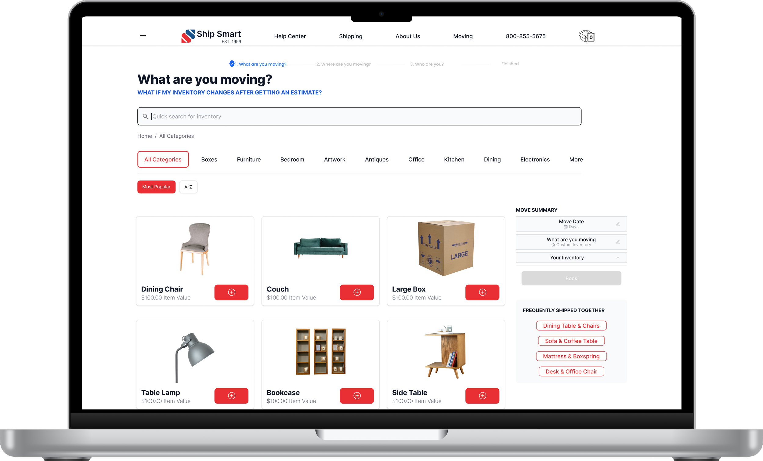
Desktop inventory search: Free-text search with real-time suggestions built from customer language.
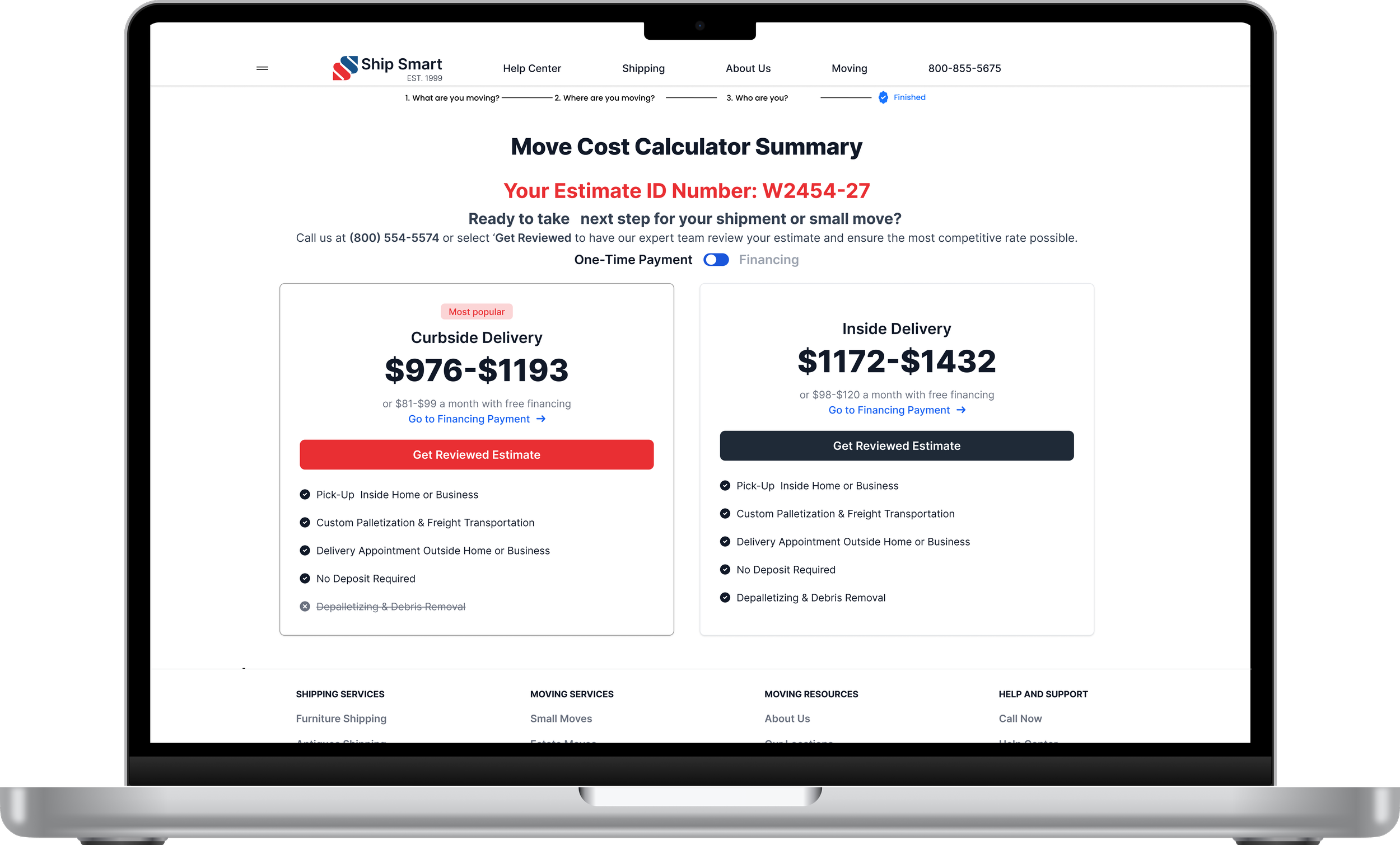
Desktop pricing page: Transparent pricing confirmation with itemized breakdown.
Business Results
The redesigned Calculator transformed Ship Smart's highest-drop-off revenue workflow into a guided, mobile-first quoting system that improved both conversion performance and operational reliability.
BEFORE → AFTER
| Customers abandoned at inventory step, unable to find items by name → Search rebuilt from chat transcripts, recognizing customer language
| Quotes required manual correction by sales team after submission → 45% reduction in manual pricing correction loops
| Users who hit a wall called support instead of converting → 22% reduction in quote-related support tickets
CONVERSION
+24%
quote completion rate
+18%
conversion to booked shipments
-25%
average time on form
SUPPORT
-22%
quote-related support tickets
-40%
pricing-related complaints
OPERATIONAL
-45%
manual pricing correction loops
│Unified pricing data model across Sales and customer tools
What I Learned
The Move Cost Calculator reshaped how I think about user input systems and revenue workflows. Quoting tools are not forms. They are structured decision environments that directly influence conversion, operational load, and pricing integrity.
When input logic is unclear or misaligned with user mental models, friction compounds into abandonment, support demand, and downstream correction loops. Real impact happens when search behavior, pricing logic, and workflow sequencing are designed as a coherent system rather than isolated screens.
The fix wasn't visual. It was architectural. The search had to understand customer language before the interface could work.
How This Connects
The pricing confusion identified in research directly informed this redesign. Negative rating patterns on estimate and pricing articles in the help center data, collected during the Product Operating System initiative, showed the same customer frustration across two touchpoints.
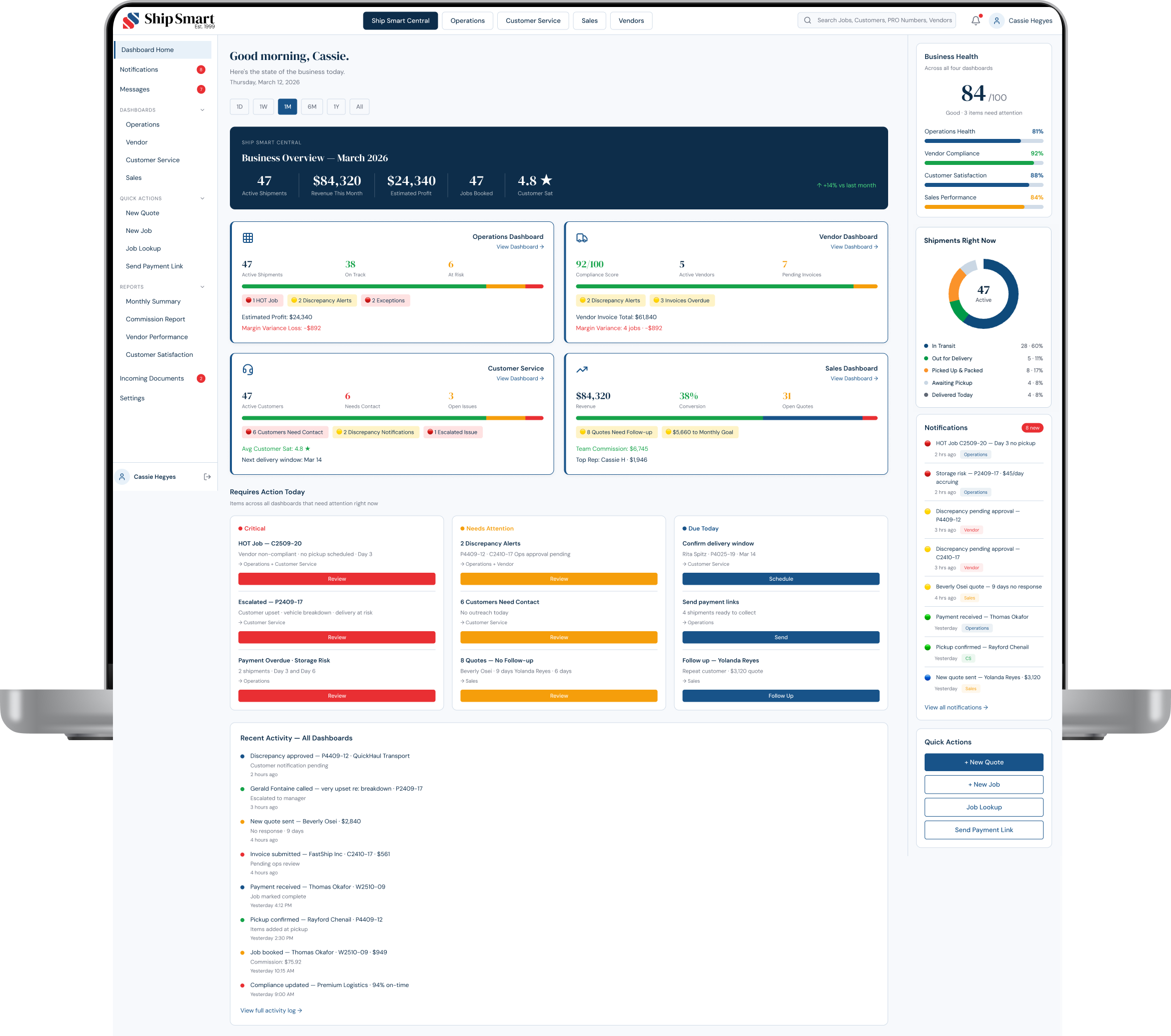
The Move Cost Calculator addressed the customer-facing layer. Ship Smart Central addressed the operational layer. Both were coordinated interventions on the same underlying platform problem.
More Case Studies