Brand Identity & OS Overhaul
Cohesive Brand System that Powers Every Product
Overview
For 25 years, Ship Smart operated under an outdated brand with fragmented messaging and a lack of documented understanding of its customers and their decision-making processes. The company had never invested in user research or established a consistent design system, which resulted in a digital experience that failed to effectively communicate its value, build trust, and scale.
I led the first comprehensive Brand Identity & OS Overhaul in the company's history, creating a research-driven framework that unifies the business from the inside out. The result is a new brand foundation that enhances every product, webpage, and customer interaction, transforming the Ship Smart brand into a modern, trustworthy small-move specialist.
KPI’s & Improvements
↑ 41% YoY increase in chat-initiated bookings
↑ 38% YoY increase in chat-based sales
↑ 173% increase in live-chat engagement
↑ 31% increase in click-through rates
↑ 62% increase in mobile sessions
Role: Lead UX & Product Designer
Responsibilities: Research, UX Strategy, Information Architecture, Visual Design, Systems Thinking, Cross-Functional Alignment, Design System Development
Timeline: 18 Months
Tools: Figma, Google Analytics, Chat Transcript Analysis, Competitive Research, User Interviews
My Process
Design Question
How could Ship Smart transform an outdated, inconsistent brand into a clear, trustworthy system that reflects the quality of service it actually delivers?

Research & Discovery
I conducted Ship Smart’s first comprehensive research initiative to understand their customers, market, and brand gaps.

Methods
Analyzed extensive customer communication data across calls and chats
Conducted user and stakeholder interviews
Followed multiple customers through complete end-to-end journeys
Audited existing branding and website experience
Performed competitive analysis and market analysis
Mapped customer journeys and service workflows
Reviewed marketing materials, sales scripts, and support logs
Customer Understanding
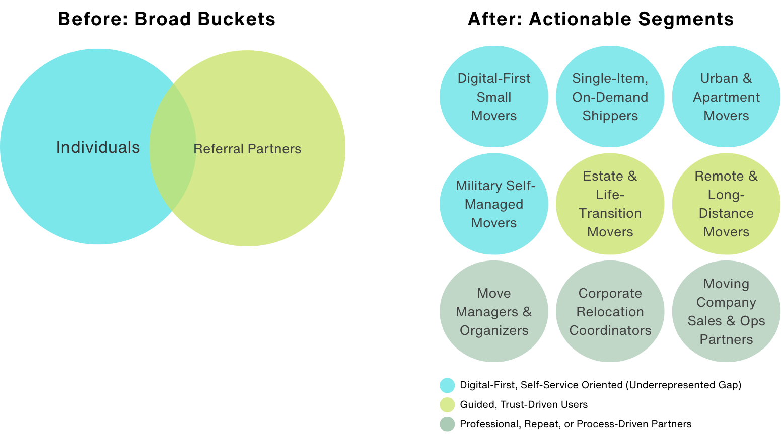
By focusing on user characteristics instead of lead sources, I identified nine key customer segments. An analysis of audience engagement revealed a critical gap: digital-first users, particularly Millennials and Gen Z, were underrepresented. This disconnect between the brand's positioning and modern customer expectations has directly influenced the rebranding efforts.
Market Alignment
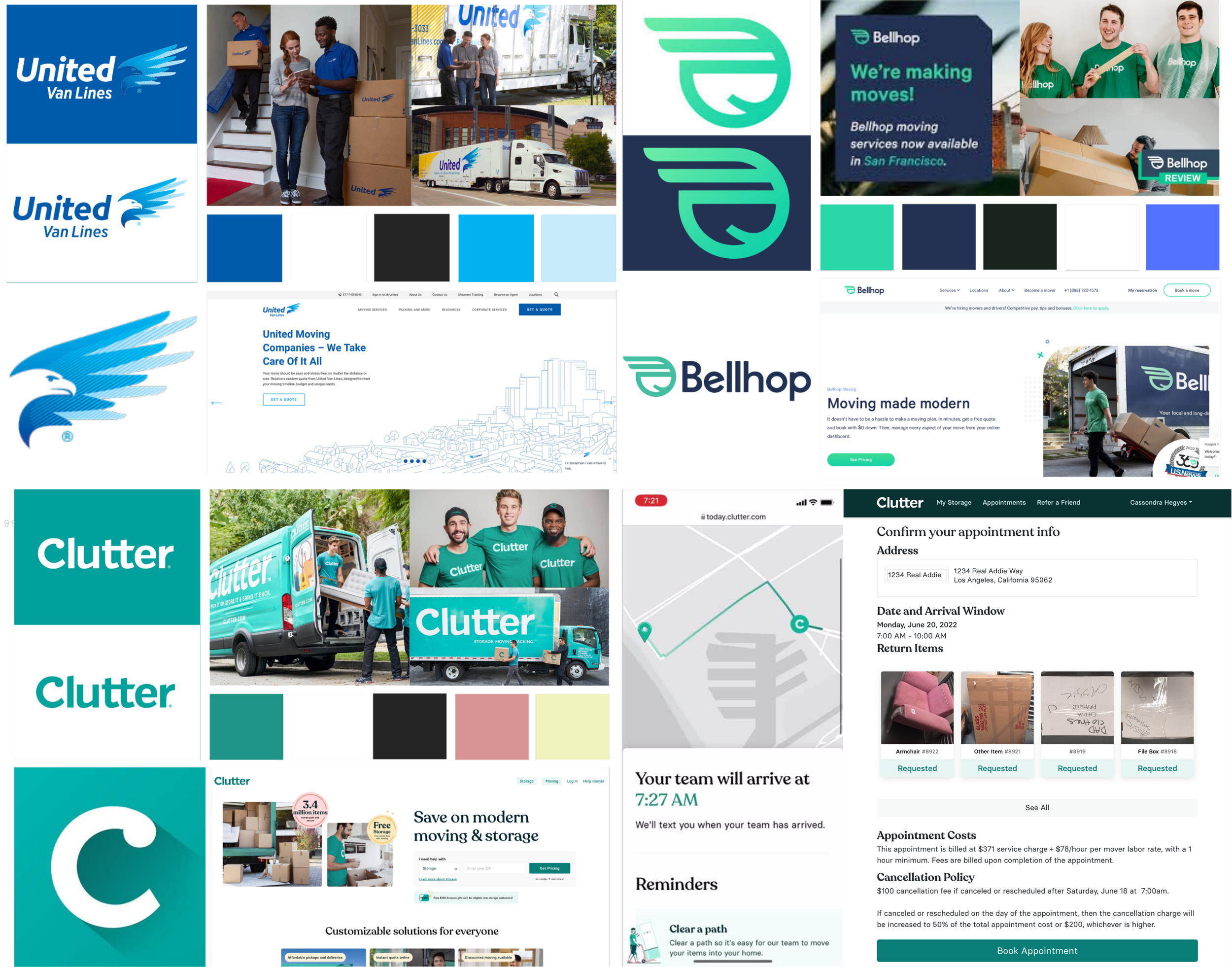
Through competitive analysis, survey insights, and firsthand experience with the most digital-first moving services, I examined how other brands successfully engage Millennial and Gen Z customers. These findings highlighted precisely where Ship Smart needed to modernize its approach.
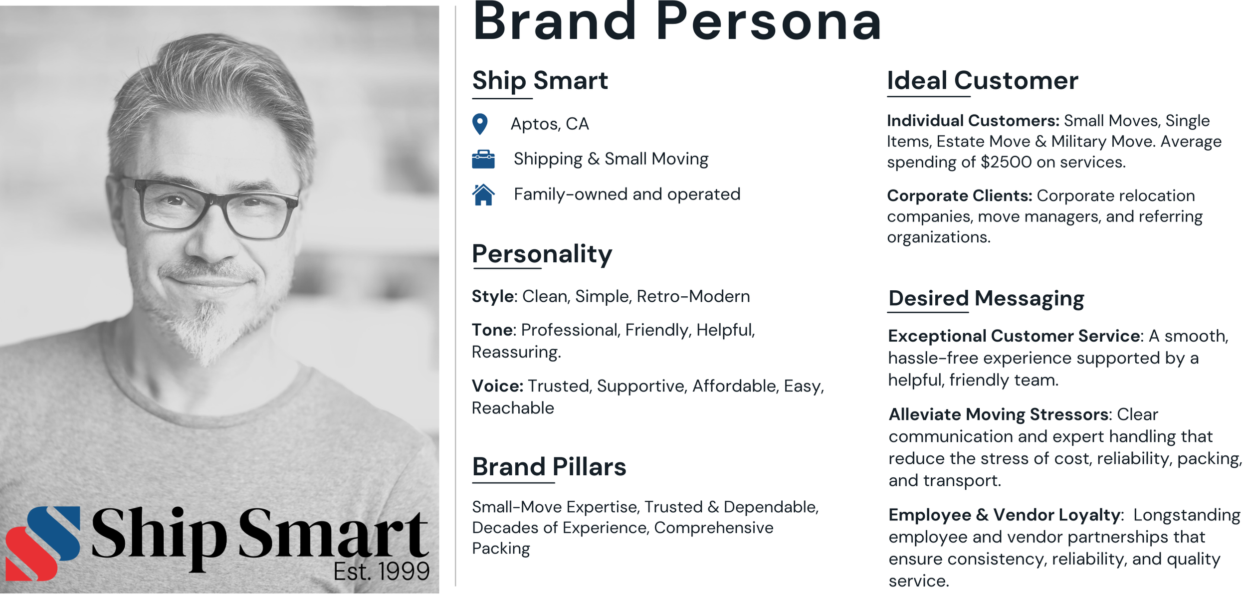
Brand Foundation
I grounded the project in Ship Smart's 25-year history as a family-owned business, emphasizing its strong relationships with employees and vendors. This established the company’s identity and differentiation in the small-move market, serving as the foundation for the brand operating system. From this work, I defined the core brand framework, specifically the Mission Statement, Selling Position, and Brand Pillars.
Mission Statement
We provide the highest-quality customer service in the industry at competitive prices, delivering the best shipping and small-move experience.
Selling Position
We specialize in small moves, offering expert packing and dependable service that make high-quality shipping easy, affordable, and stress-free.
Brand Pillars
Small-Move Expertise, Trusted & Dependable, Decades of Experience, Comprehensive Packing
Brand Voice
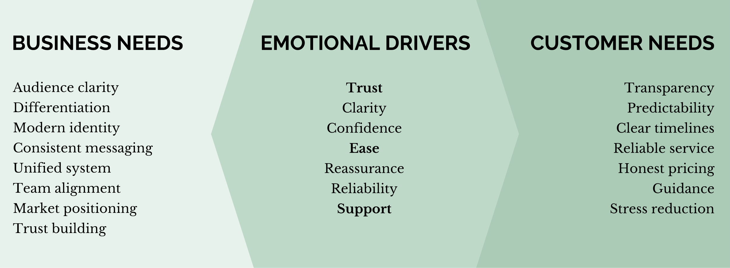
I analyzed the business and its customers’ needs, uncovering shared emotional expectations that defined the brand’s personality. I then crafted a consistent voice that reflects these qualities in every interaction.
Trusted. Supportive. Affordable. Easy. Reachable.
Brand Tone
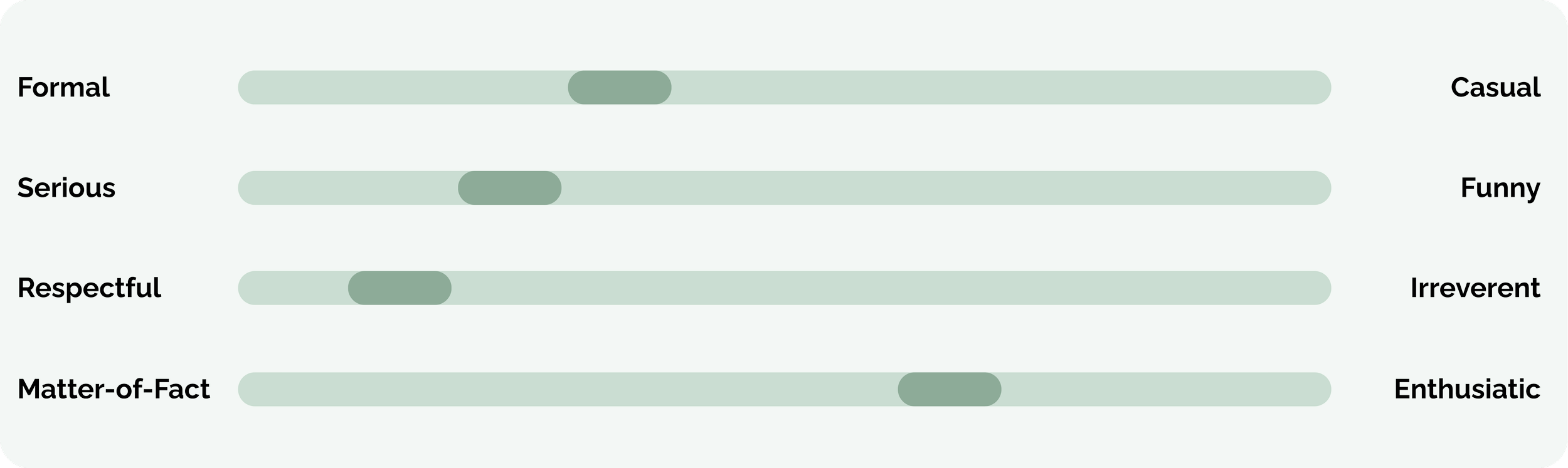
By understanding the brand and its customers, I developed a tone that reflects the brand’s essence, while ensuring empathy in every interaction and aligning with the brand's values to support its customers.
Professional, Friendly, Helpful, Reassuring
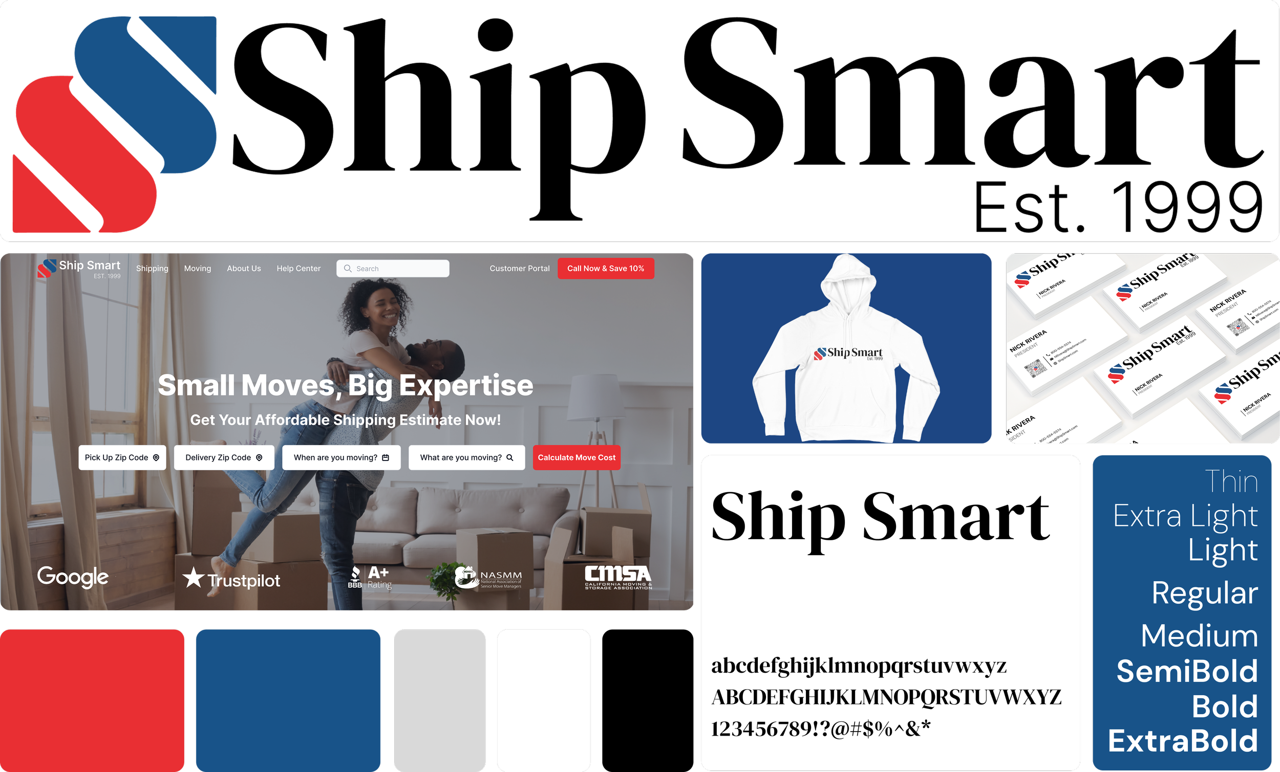
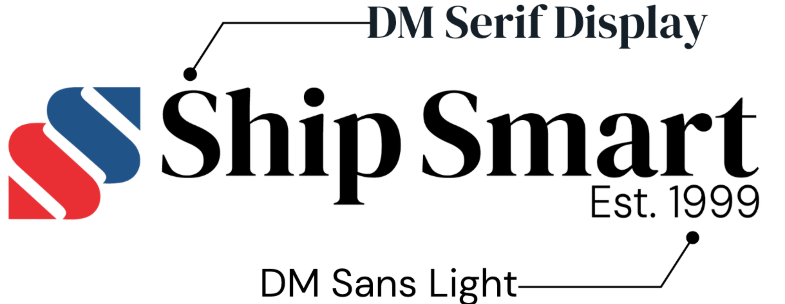
Brand Style
To bridge Ship Smart’s long-standing heritage with the needs of modern customers, I created a style that reflects the company’s reliability while delivering the clarity and ease digital-first users expect.
Clean, Simple, Retro-Modern
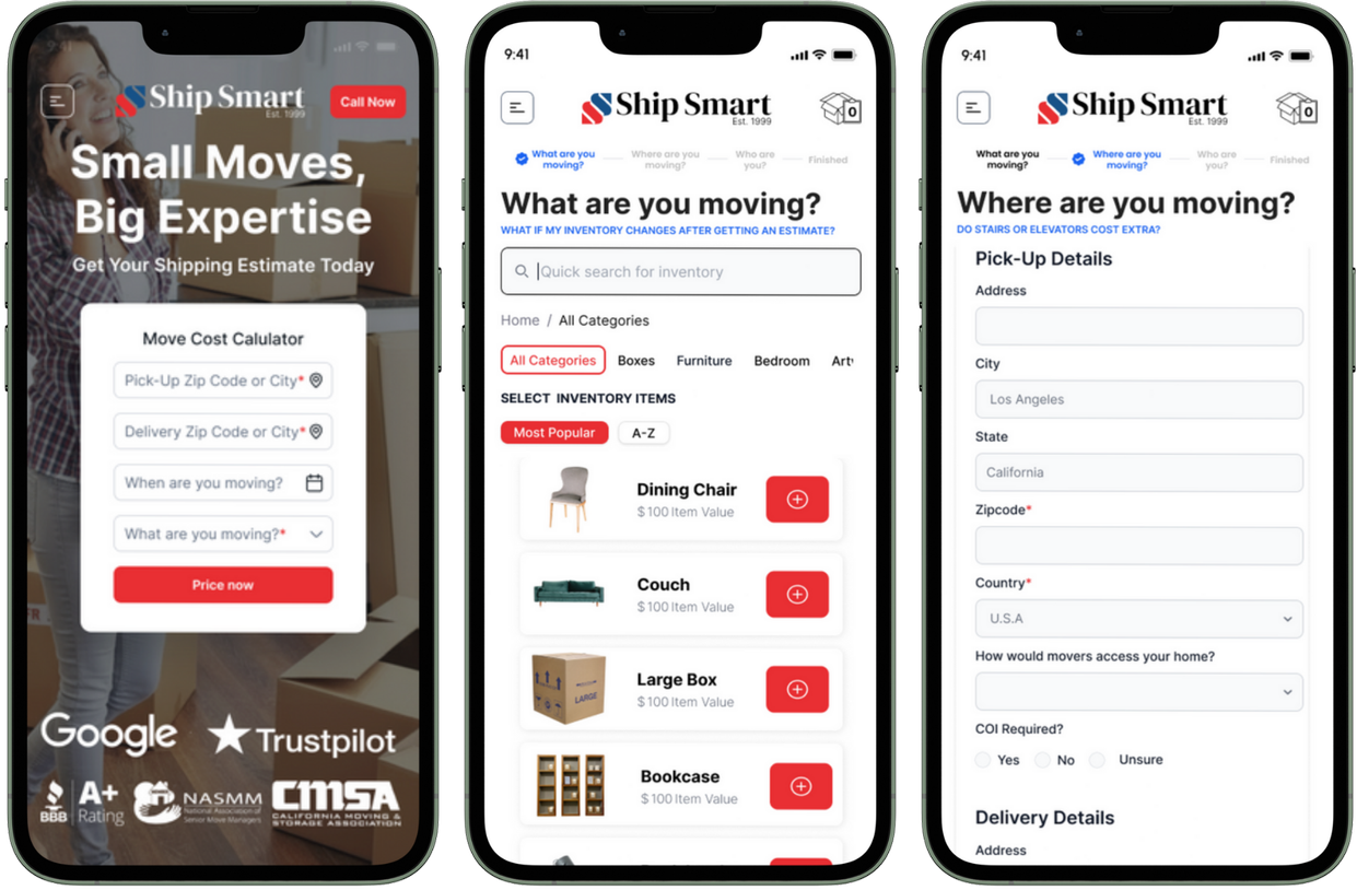
Final Design


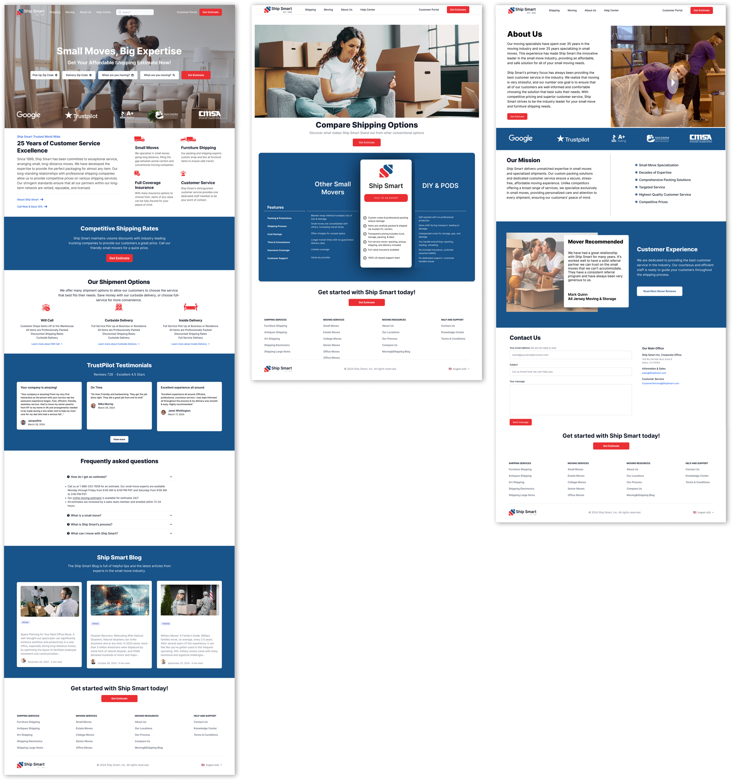
Business Results
By understanding the brand and its customers, I developed a tone that reflects the brand’s essence, while ensuring empathy in every interaction and aligning with the brand's values to support its customers.
KPI’s & Improvements
↑ 41% YoY increase in chat-initiated bookings
↑ 38% YoY increase in chat-based sales
↑ 173% increase in live-chat engagement
↑ 31% increase in click-through rates
↑ 62% increase in mobile sessions
What I Learned
This project reshaped my understanding of brand systems as the foundation of product design. I learned that without a clear customer definition and unified communication, even the best products struggle to succeed. Creating the Brand OS showed how alignment across teams leads to clearer experiences, faster development, and stronger customer trust.